

8 Examples of High Converting Email Capture Forms
Let’s talk about email and SMS marketing.
Email is not dead—far from it. According to Litmus, every $1 spent on email can generate up to $36 ROI). Today, armed with data, marketers like you and me have near infinite opportunities to segment, personalize, and create more enriched and effective email campaigns.
In addition to email, the smartest brands are also investing in SMS marketing, which is the practice of using text or multimedia messages to communicate with customers. It’s no wonder brands are prioritizing SMS: in 2023, an impressive 71% of consumers opted in to receive SMS communications from businesses (SimpleTexting survey). SMS has an advantage over most other digital channels with click-through-rates of 19%, which are significantly higher than email (3% CTR) and Facebook (1% CTR). It also has the benefit of reaching customers who might not be present on channels like email or social.
Email and SMS are a critical part of your omnichannel marketing strategy. To unlock their full potential, brands must start by collecting this information from visitors. To do this, they should focus on building a high converting email (& SMS) capture on their website. Without this, brands are not able to capitalize on their outbound marketing efforts and effectively grow their subscriber list.
Below, I share 8 examples of high converting email capture forms that marketers can reference to optimize their email & SMS capture methods:
1. Drip
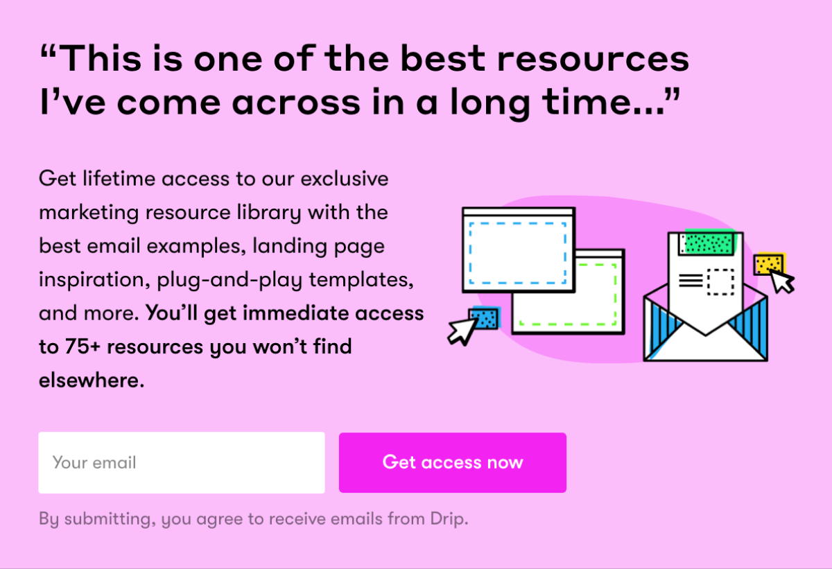
Let’s give two thumbs up to this eye-catching module from the marketing automation platform, Drip. This module lives on each of their Blog pages, and I love it for a few reasons:
- It builds trust through social proof.
- The pink color contrasts with the Blog’s white background.
- The content explains what you’re getting and why it’s valuable, and demonstrates exclusivity by stating “…you won’t find elsewhere.”
- Good use of copy, color, and illustration.
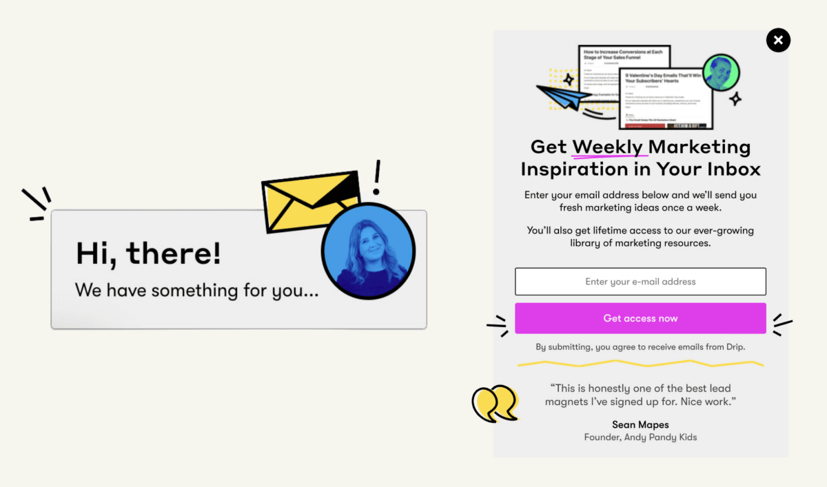
Drip also has a widget at the bottom right of their Blog pages, which opens to an email capture popup. Here’s why this sequence is great:
- The widget copy builds anticipation by telling the user there’s something for them to see, but they don’t reveal what that “something” is.
- The widget includes a photo of a human, which tells us there are real humans at Drip that are there to take care of us. I like this treatment of the human image as it maintains anonymity by adding a solid blue overlay and leaves out names and other identifiable information.
- Both the widget and popup include visual accents/doodles that are fun and engaging. They draw the user’s attention to the “Get access now” CTA.
- The popup email capture tells you exactly what you’re signing up for and is paired with a quote to demonstrate social proof.
2. Tushy
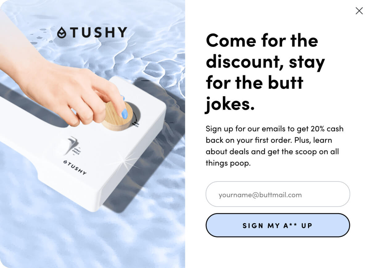
This email capture from the wellness company Tushy is one of my favorites. It combines beautiful lifestyle & product imagery with clever copywriting. The choice of photography is smart, as photos with hands/humans tend to convert much better than plain product shots. Tushy’s brand voice also comes through in a variety of ways here, from the headline to the CTA all the way down to the placeholder copy.
Additionally, Tushy makes a unique offer to its customers: cash back on your first order. We typically see brands provide the standard 10-20% discount on first purchase, but Tushy continues to challenge the status quo with a compelling 20% cash back promise.
3. Brightland
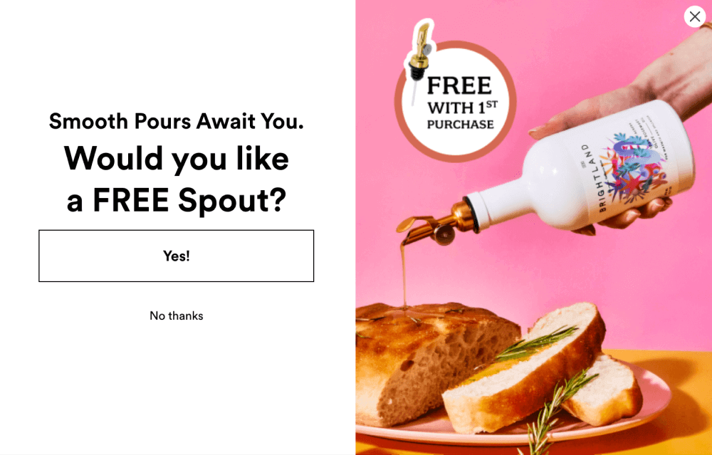
Brightland’s email capture popup offers a complimentary (and complementary) gift with purchase rather than a percentage or dollar discount. The gift enhances the value of the products that Brightland sells, which likely has a positive downstream effect on conversion rates. After all, if I already have a free spout, I’ll need some olive oil to use it with, right?
The photography is eye-catching with its vibrant pink background, and its content shows the product in action, prompting visitors to imagine themselves using it (and eating that crusty, delicious-looking rosemary bread). The fact that the photo also has a callout badge showing the gift with purchase (GWP) and emphasizing that it’s free also helps visitors understand exactly what they are getting.
The CTA is well-designed, too. Instead of asking for the visitor’s email immediately, they ask a simple yes or no question. Since it’s a lot easier to click a button than it is to type in your email address, this approach takes much less energy for a visitor to get started. That said, once a visitor begins toward a goal, they’re much more likely to complete it—that’s commitment and consistency bias at work.
4. Firebox
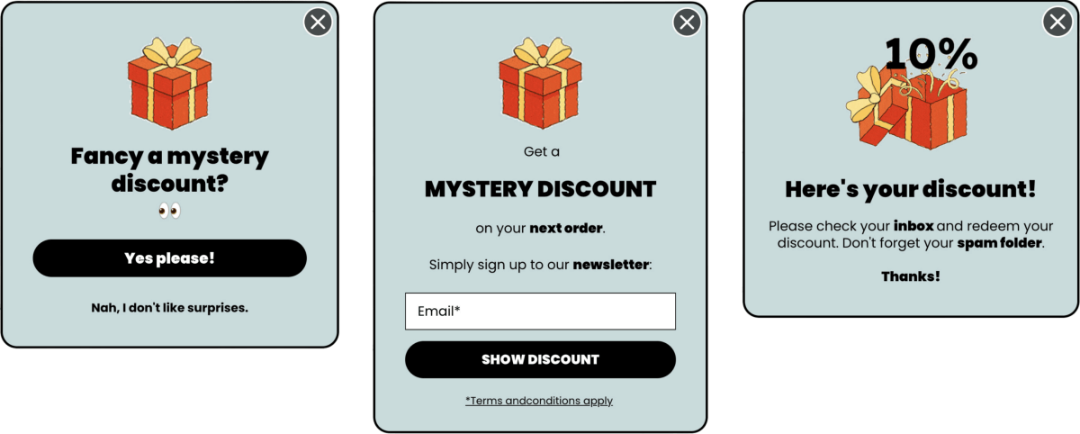
I love this mystery discount from Firebox! First, let’s discuss their smart design choices. They chose a modern & muted background color that contrasts well with the bold typography. The use of emojis gives this popup a fun and playful feel, which is compounded by the bright orange gift box that is actually a GIF, bringing eye-catching movement to the entire modal.
The copywriting also introduces a common marketing tactic: FOMO. This popup builds FOMO in a couple ways:
- It tells users there is a mystery discount waiting for them. Since it’s a mystery, the sky’s the limit as to how much of a discount the user could receive. This provides a fun, spontaneous, and low-stakes way to gamify a new user discount.
- It tells users they’ll miss out on something interesting if they fail to provide their email (“No, I don’t like surprises”).
5. Cuts
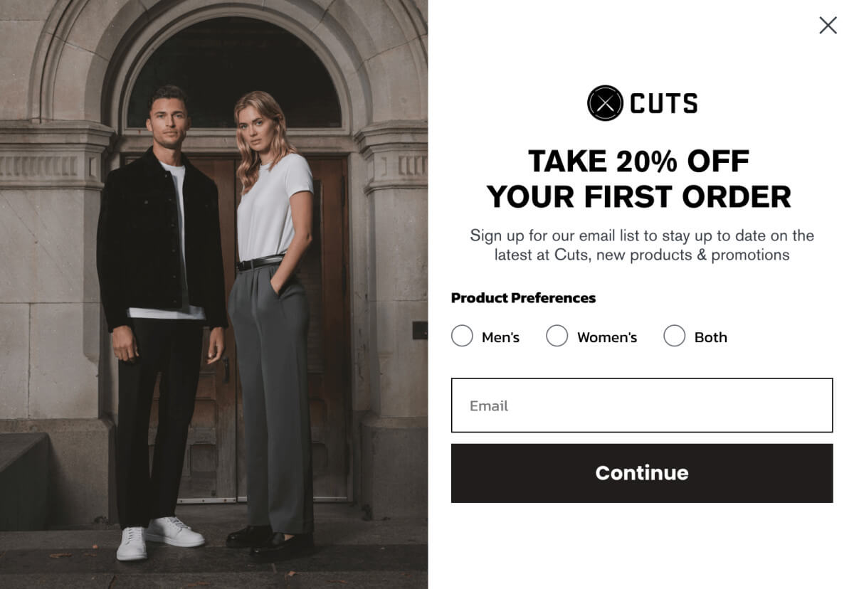
Cuts has a typical eCommerce email capture layout. The popup has a clear headline and information hierarchy, and it’s great because it gives users an incentive to sign up. Generally, it’s best practice to give your audience something in exchange for valuable information (e.g. a discount in exchange for an email address).
This form also lets users select which emails are most relevant to them, which is important for personalization and also gives the company valuable demographic information. They’ve also included a pared back version of the email capture in the website footer, which (importantly) includes the Men/Women/Both radio buttons.
6. Revival
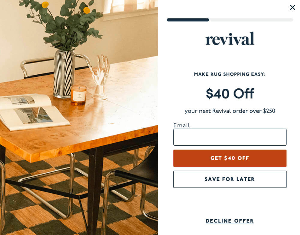
Revival’s email capture popup is a full screen takeover with a very clear (and high-value) offer. They request both email and SMS information, but split each request into two pages to maximize the likelihood of collecting at least the email address. When a visitor fills in their email, they’re taken to the next page and the progress bar inches forward to let customers know they’re close to getting their discount.
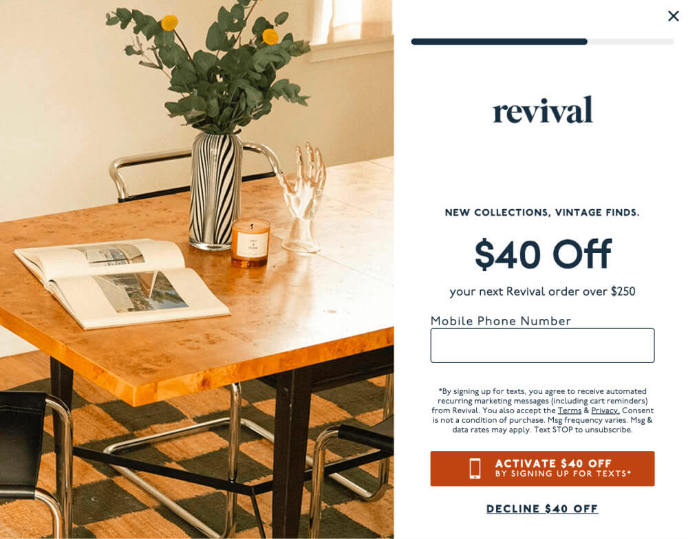
I love the bold and high-contrast CTA button, as well as the button text that emphasizes the value of the offer. Revival chose to provide a dollar amount off instead of a percentage discount. This is because dollar amount savings appear to be larger than percentage savings, a simple “trick” that goes a long way toward improving conversion.
7. Fly by Jing
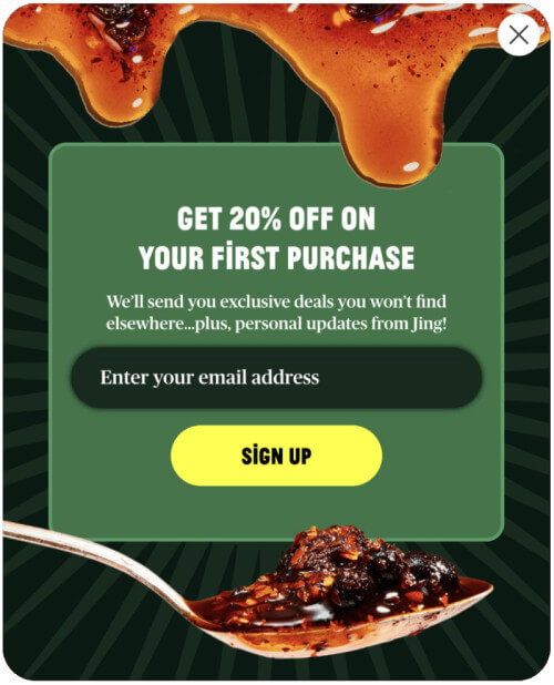
Fly by Jing’s email capture areas are bold and high-contrast, just like their flavors. The popup shows the product itself, which is smart since popups cover up the rest of the content on the site. It’s generally good practice to use product photography to remind customers where they are.
They also provide an incentive for visitors to sign up (20% off) and the copywriting is energetic, using descriptive terms like “electrify” and “mouthwatering”. The copywriting could be improved in the CTA though, emphasizing the benefit of signing up rather than using generic text like “Subscribe” and “Sign up”. While the CTA is clear, it feels a bit bland compared to Fly by Jing’s otherwise maximalist brand.
8. Eight Sleep
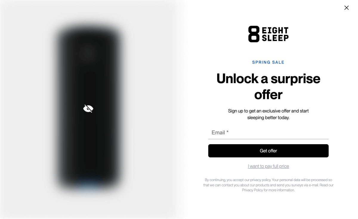
Eight Sleep’s email popup takes over the entire screen and features a surprise offer. The design is clean and crisp with sharp lines, making the blurry image stand out even more, piquing curiosity.
Their message is straightforward: sign up and get a deal. Importantly, the product’s benefit is included in the popup too: improve your sleep immediately. The mention of a Spring sale also adds a slight sense of urgency to the mix.
The main CTA is clear—“Get offer.” The alternative, “I want to pay full price,” is a clever nudge. It makes you think twice about walking away from a good deal while also hinting at the type of offer that’s behind the email signup (a product discount). Simple and effective, with a psychological edge.
Wrap up
There are tons of methods you can use to improve your onsite email & SMS capture. We explored a few practices above, including:
- Gamification
- Personalization
- Social proof
- Promotional offerings like percentage discount, dollar amount savings, gift with purchase, and cash back
- Benefits-oriented language
- FOMO
- Mystery discount / surprise and delight
- Bold and compelling colors, copywriting, and imagery
- Product photography
- Urgency through time-sensitive offers
Once you land on a strategy for your email capture, there are a slew of tools you can use to implement your capture form. I like Privy and Justuno as affordable options that you can grow with, and Wisepops for brands that are ready to invest more heavily in onsite marketing. Be sure to also check your email platform (Hubspot, Klaviyo, Intercom, etc.) to see what they include in their standard service packages. You may be able to embed a form or popup for free and with minimal development resources.
Lastly, before you launch your email and/or SMS form, I suggest reviewing it with an optimization expert to ensure your form is optimized for conversion. I started Flourish Commerce to help with this—we provide free website audits to help brands identify new opportunities to grow revenue and average order value. We also offer implementation services, making it a great solution for end-to-end planning and implementation of your email capture.
About the Author

Erin Gusty is the co-founder of Flourish Commerce, delivering actionable design audits to help eCommerce brands grow their business through website optimization. Erin is a seasoned operator and leader with 10+ years of startup experience across marketing, product, eCommerce, and customer experience.


