

Is your website capturing enough mobile traffic? Find out with mobileratio.com
With the progress of innovation, smartphones and tablets have captured the imagination of users across the globe in such a manner that any website which does not cater to the requirements of these devices is considered outdated. Your website might be attracting huge traffic on computer web browsers, but unless it does so on tablets and smartphones too, its impact won’t nearly be as spread out as you would like. So it is necessary to ensure that you cover all possible ends there are to make your website suitable for mobile device browsers too. From the design to the interface, touch-screen response to animation, you’ll have to consider everything.
Say you’ve done all there is to make sure your mobile website looks and feels as good as the computer version and you’ve even tested it on all mobile operating systems and browsers. Now you’re good to go ahead and expect decent traffic to your website on both computer and mobile devices. You would of course want to know how you’re faring.
Enter “Mobile Ratio”.

Mobile Ratio – How mobile is your website?
Mobile Ratio is an amazing online tool which helps you in finding out what percentage of your website’s traffic is coming from which devices. This intuitive tool assists users to track their website’s traffic coming from Smartphones, Tablets and Desktops. In this sense it is a step ahead of conventional analytic tools which simply offer website traffic details but do not let the user know exactly the kind of device where the traffic is coming from. Knowing the device from where the traffic is coming is of great significance since users can expand their reach and audience simply by paying more attention to the least covered section and make improvements there.
This is how it rolls
As a first step, you need to sign into the tool using your Google account details. Once logged in, the tool prompts you to select the domain you want to analyze. Now an important thing to note here is, you’ll only be able to track the mobile traffic of those websites on which you already have the Google Analytics tracking code installed. That is, if you’ve tied up any of your domains for traffic tracking with Google Analytics, mobileratio.com will pull the data of those websites from Google Analytics and quickly display that in a simplified form.
So basically, after you sign in, the tool scans all domains linked with the Google account you used to sign in, picks out the ones which have Google Analytics installed and displays them in a drop down. Once this is done, you can select the domain you want to analyze.
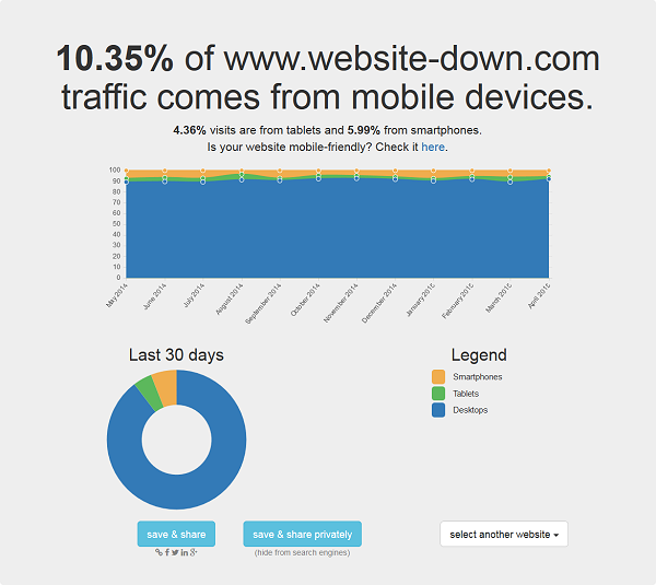
Once you do so, Mobile Ratio makes use of Google Analytics to gather your website traffic details. It then goes a step further and breaks down the report based on the kind of device used to access your website and displays the report with the percentage breakdown. The report is presented to you as an attractive graph divided into 3 colors, each representing a device. The graph has percentage values on the Y axis and months on the X axis which helps you get a crisp picture of where your actual audience lies. A similar colored pie chart also depicts the same information but over a time span of the last 30 days, making everything more comprehensible.
A good thing here is that you don’t need to register or sign up. You can just use your Google account details to sign in and your data is not even saved. It’s a one-time sign so no security concerns there!
And of course, offering such a cooperative tool at no cost makes the effort of its makers all the more appreciable!
Additional Features
If you thought that was all there was to it, well you’re wrong! Some really awesome features of mobileratio.com include its social features. You can choose to save the report publicly or privately and also share it via a link which is provided when you click on any of the buttons given below. You can analyze as many websites as you want with this tool for absolutely no cost. Yes, it is totally free!
Also, if you look at the picture above, there is a link which facilitates checking how mobile-friendly your website is. Clicking on this link takes you to Google Mobile-Friendly Test page where your website is analyzed for mobile friendliness. The best part about this test is that you will be given a sneak peek at how your website appears to Googlebot and you’ll be given pointers for improving your shortfalls. Wonderful!
Quickly check how much mobile traffic is your website getting mobileratio.com/ via @supermonitoring
Summing it Up
There’s a difference between having a website and having a great website. One which caters beautifully to all devices, operating systems and browsers and is still able to capture its target audience is a website worth the time and effort. And Mobile Ratio is a brilliant tool for people who want to do just that! Try it out today and experience its utility.


