

How to Test Website Responsiveness with LambdaTest – a Step-by-Step Guide
The Internet traffic from mobile devices has reached 60% of total traffic. Could this mean that developing a website for a mobile device is now more important than a desktop? Well, search engines like Google indicate the same direction as the statistics above.
While earlier search engines would ask the website owners to enable “mobile-first indexing,” signifying that their website can be viewed on a mobile, as of September 2020, all the websites will be considered mobile-first. Therefore, Google assumes all websites are responsive and penalizes those that its smartphone bot finds non-compliant.
So, what good is our website when it does not appear in the search results? Considering 93% of website traffic is driven by search links! This is where responsiveness comes into the picture, and testing for it makes an even harder job with greater responsibilities. Do you think this job can be accomplished without taking help from a platform or tool? Maybe.

However, over time, one may need to turn to cloud-based testing platforms like LambdaTest to check responsiveness across different browsers and screen sizes.
In this step-by-step guide, we will learn two methods: how to test website responsiveness across different browsers using LambdaTest and on various device viewports using LT Browser.
The first method involves using LambdaTest, a platform that allows you to test websites across different web browsers. This method will help you ensure your website looks and functions correctly on various browsers such as Chrome, Firefox, Safari, etc.
The second method involves using LT Browser, another tool provided by LambdaTest, for testing website responsiveness on different device viewports. This method helps you see how your website appears and behaves on various screen sizes, such as mobile phones, tablets, laptops, and desktops.
Impact of Responsiveness on the Business
An application’s responsiveness directly relates to how a business performs and its revenue collection. This is a result of the following reasons:
Alienating non-desktop users
A non-responsive web application will alienate non-desktop users, often including large-screen mobile devices like tablets. This will result in huge losses because a large amount of traffic is generated from these devices.
Brand credibility
Brand credibility is established when the user is comfortable doing all the actions they wish to do on the application. However, without a responsive website, they may face certain challenges that spoil the experience and force them to close the website. This can hurt the brand credibility for that user and those who connect with him through word of mouth.
High bounce rate
Bounce rate means exiting the website by viewing only one page. A high bounce rate means the majority of the users are a part of this process. Unsurprisingly, when the application is not responsive, the user may be able to land on it from external sources, but after seeing the issue, the user will exit promptly. A high bounce rate suggests to search engines that the content is irrelevant to the website, even if it may not be the case. Hence, the engines will decrease the rankings and slide them down to other pages, directly resulting in revenue loss.
Search engine penalty
While a high bounce rate will eventually decrease the application’s search ranking, search engines penalize a non-responsive website as it may not provide a good user experience.
Competitive advantage
When a business does not worry about its website being responsive, it pushes the users towards their competitors. This redirection is non-reversible for most of the customers (around 88% of them). Given that the user will have to accomplish the tasks they have in mind one way or another, the business may unintentionally increase the competitor’s revenue that could have been theirs.
Hurt direct transactions
Businesses may have many sources of income through their application, which will eventually degrade over time due to non-responsiveness. However, a direct loss will be taken from the transactions the customers could have done if their experience had been smoother (particularly eCommerce). Businesses will also lose the leads they get with these transactions, which could have been converted later.
Clearly, if the website is not responsive, it will not matter how perfect it is for the desktop. It will still lose money and hinder the growth of the business, which is one element on which each business entity depends. With that mentioned, it is also seen that most people correlate responsiveness with only rescaling page boundaries. While this is true, it is just one element of being “responsive” for a website. In reality, it means much more than that.
What Are the Elements of a Responsive Website?
A responsive website can be called “responsive” when the following elements are flexible (scale as per the device size) correctly.
Viewport
The first thing that comes to mind for responsiveness is whether or not the application is crossing the viewport boundaries. This is the first and most basic element a developer should consider.
Image
Responsiveness in images goes beyond just their rescaling. It is important to understand that once an image rescales, it might lose the subject focus as it was made for the desktop viewers. There are methods to tackle the image responsiveness problem, which should be used for a better experience.
Font
The website’s font should also be handled on different devices. The font can be smaller on desktops due to the large screen size. Therefore, when we generally take 16px on the desktop version, we think mobile should have 10px or 12px. However, since desktop fonts are smaller by default, we cannot decrease the font so much on a mobile. On mobile, it has to be at least 16px for a comfortable experience. Content-heavy websites may have to take extra precautions when applying suitable font sizes based on the viewport.
Grids
CSS Grid elements are fixed-sized boxes of various lengths to organize the web page’s content. With varying viewport sizes, these boundaries may produce abrupt visuals with sometimes overlapping boundaries and out of proportion if the margins are fixed. Responsive websites have to provide fluid grids that change their shapes according to the device and hence never compromise on the visual element of the page.
Navigation
Navigation bars are also one of the elements that will require careful consideration when the website needs to be responsive. Normally, on desktops, the navigation bars are shown explicitly with text as they are. However, if everything is kept the same, these text and individual bars will shrink to tiny sizes, making it difficult for the user to operate. Developers devise creative strategies to deal with mandatory navigation bars to provide these options but with the correct dimensions. Hamburger menus are one of the popular options in this regard.
While these are some tricky elements, they are not the only ones. It is important to remember that each element is as important as another for responsive testing because no one can calculate their behavior on various devices. It is recommended that rigorous, responsive testing with tools like LambdaTest is always performed for a better quality application.
How to Test Website Responsiveness Using LambdaTest?
A decade ago, testers would test a website on a few devices manually. Their main motive was to seek rescaling capabilities and whether the web application delivered functionally. Those were when devices were few, and search engines did not care much as mobile Internet traffic was just 28%.
A decade later, the tables have turned, and mobile domination has introduced some complex technologies for web development. If anything, it has proved that manual responsive testing is not a good idea anymore, and organizations require a tool that can facilitate the process and help wrap things faster without compromising on the test or product quality. This is where LambdaTest has been able to help the community.
With more than 3000 devices on the platform, LambdaTest provides an ideal environment for the testers to test their application’s responsiveness with tools that help them on the way.
Some of the key features of the platform include:
- Visual testing: This helps identify visual element errors by comparing them with a base image. Sometimes, this even means those errors that human eyes cannot spot.
- Real device testing: The tester can operate on a cloud like a physical device.
- Automation testing: The support for automation testing helps testers perform manual and automation-based tests in a single place.
- AI-powered: The power of artificial intelligence will not just execute but “HyperExecute” your tests by carefully making intelligent decisions during testing that include understanding and combining data and logs in a single file.
- Integrations: Once the responsive testing with LambdaTest is concluded, the tester can take advantage of hundreds of integrations through which the test data can be carried to other tools for a seamless testing experience.
Responsive Testing on Virtual Devices
In this section, we will list down the steps to perform responsive testing on virtual devices:
Step 1: Sign up on LambdaTest
To take advantage of the above features, the testers must first sign up for free on the platform. Once done, log in with your credentials.
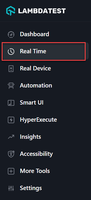
Step 2: Navigate to Real Time Option
You will arrive at a personal dashboard where all the past test-related data will be summarized for a quick glance. Navigate to “Real Time” from the left side panel.
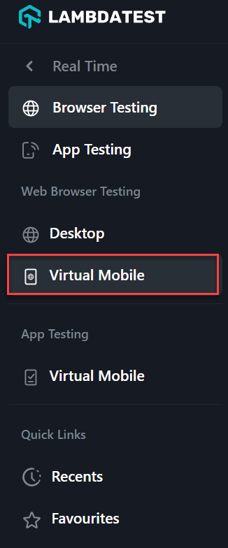
Step 3: Choose the Virtual Mobile Option
Here, we get an option to run the website on either a mobile or a desktop. Presuming that the website was built and tested on a desktop, for now, we will select “Virtual Mobile”.
Please note that while this demonstration uses “Virtual Mobile”, responsive testing includes testing on all the desktop browsers, operating systems, and their versions.
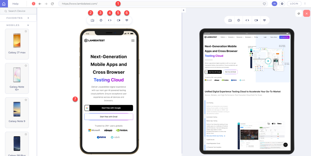
Step 4: Select Your Test Configurations
The above selection will open up a panel where we can select the device to operate, the browser to open the application, and the website address to open it on the selected specs:
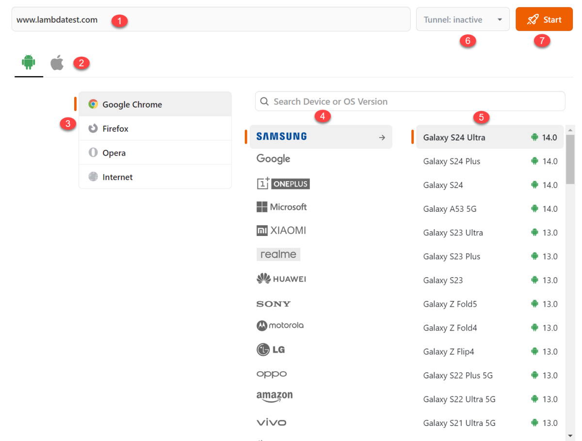
As seen in the image, here we make seven choices:
- Web address: The website or web application we wish to open.
- The operating system: Selecting a mobile operating system. We have selected “Android” here.
- The browser: Select the browser to open the web address. We have chosen “Google Chrome” here.
- The device manufacturer: Select the device manufacturer to get the list of their devices. This will depend on the selected operating system.
- The device: Select the actual device that the selected device manufacturer has launched.
- Tunnel: A tunnel is used for local web app testing, i.e., testing websites that have not yet been published online.
- Start: This button will pick the selected specifications and start the launch process.
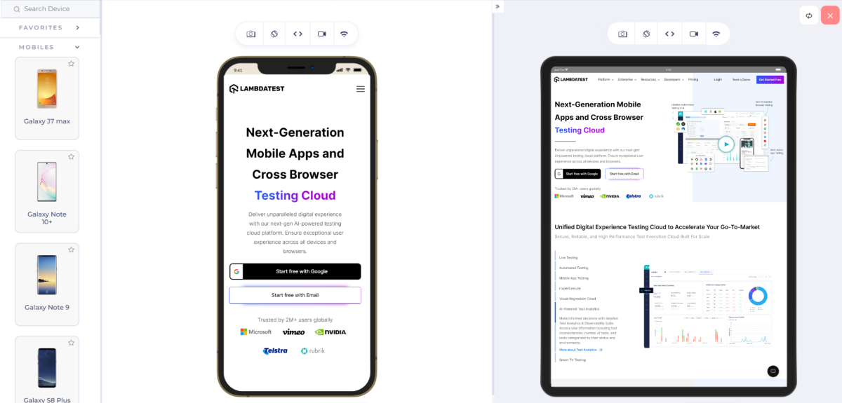
Step 5: Start Testing
We will click on the Start button once all the specs are selected.
In a couple of seconds, the device will pop up with the website already opened.
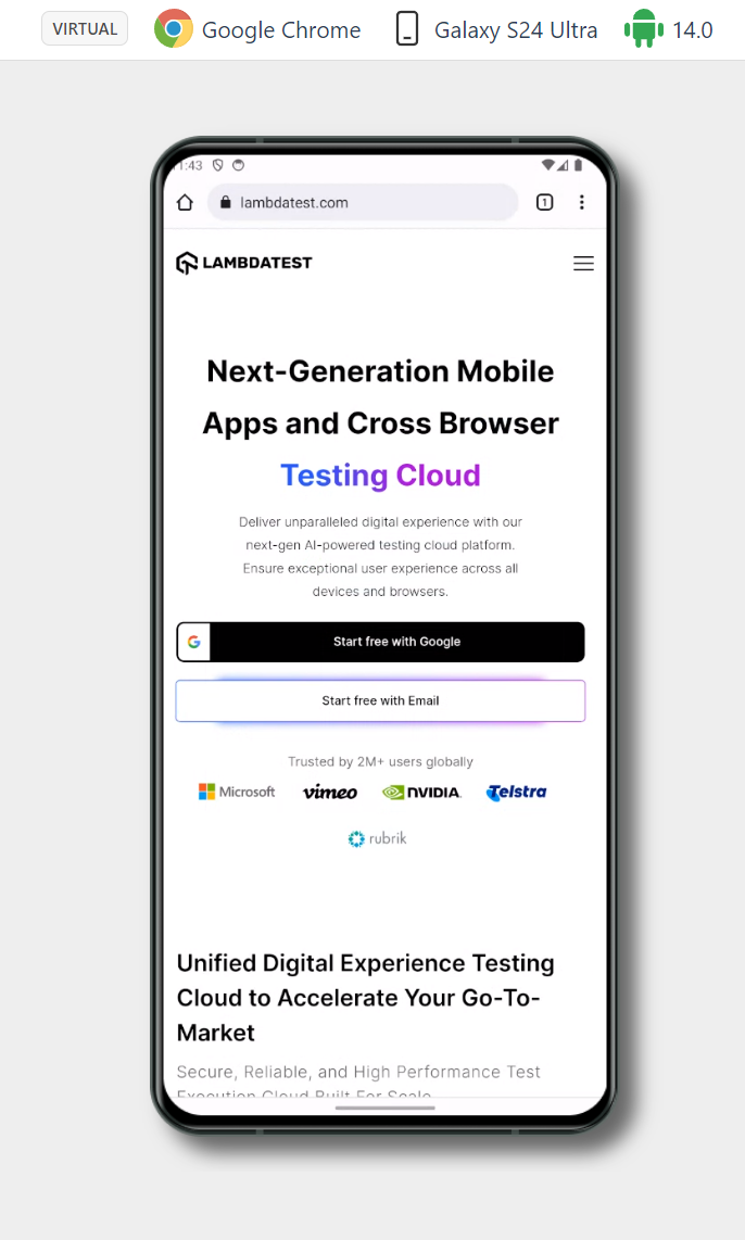
A lot of tools will be listed on the left side tool panel to facilitate responsive testing, as mentioned in the tool features.
The tester can now operate the device similar to a physical device. All the files created during the session will be saved in “Projects” and “Gallery, ” including screenshots and video recording files.
Notice that the option we selected to reach here was “Virtual Mobile,” as this testing was intended on an emulator rather than a real device. However, the tester can also opt for real devices.
Responsive Testing on Real Devices
In this section, we will list down the steps to perform responsive testing on real devices:
Step 1: Choose the Real Device Option
From the left tool panel available on the dashboard, click on “Real Device”.
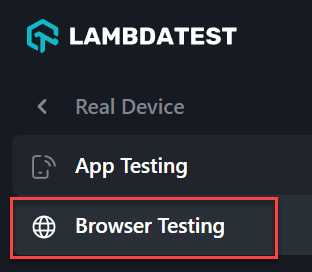
Step 2: Select the Testing Type
This will open up two choices denoting two types of real device testing allowed on LambdaTest:
- App testing: For native apps.
- Browser testing: For web apps.
Step 3: Choose Browser Testing
We need to select “Browser Testing” here. The same panel will open up, but the tests will be executed on a real device sitting at a physical location and connected to the infrastructure.
Different scenarios will require different types of devices; hence, the tester can choose the best option according to their analysis.
How to Test Website Responsiveness Using LT Browser?
LT Browser helps us with the same problem by providing a dedicated browser for responsive testing. It provides us with pre-defined devices with pre-defined specifications to launch the website (although custom devices can also be created).
So, why do we need a dedicated browser when we could launch the website from the LambdaTest account? Well, there are a few advantages of it:
- A dedicated browser provides dedicated support tools that are designed just for responsiveness.
- The browser runs on the hardware of the system and hence OS related calls can be verified easily and accurately.
- LT browser can open two devices simultaneously, providing a side-by-side comparison for better analysis.
- It is impossible to open the dev tools or web inspector on a browser running on a device in the cloud. LT Browser provides this feature built to debug web app elements quickly.
- LT Browser provides Google Lighthouse reports to analyze the website metrics easily.
- The browser provides a hot reloading feature where the changes can be seen live on the screen and dev tools just by reloading the screen.
- The network throttling feature can help you assess the website’s behavior under different network conditions without actually making those changes in the actual network.
Step 1: Download LT Browser
Such advantages make it necessary to use the LT Browser which is free and just a download away.
Once downloaded, it will resemble a lot of other major browsers because it is built on the Chromium engine.
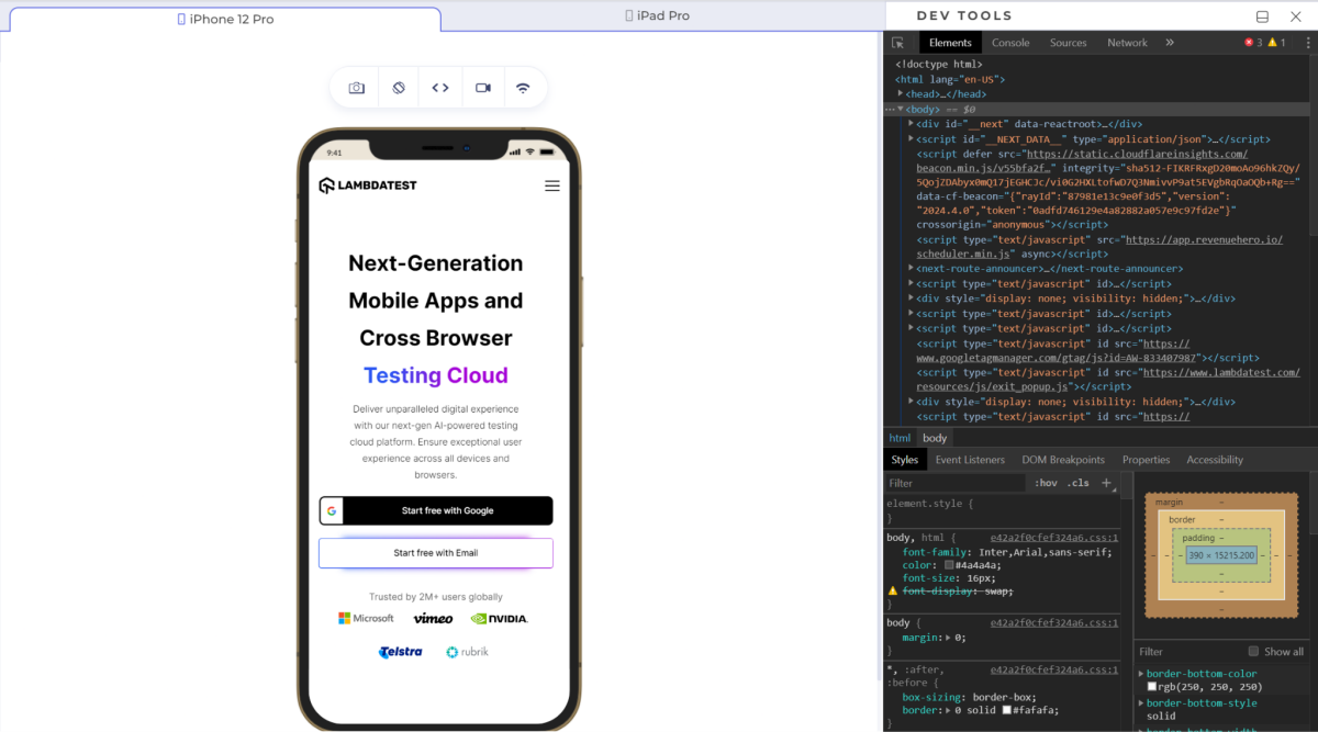
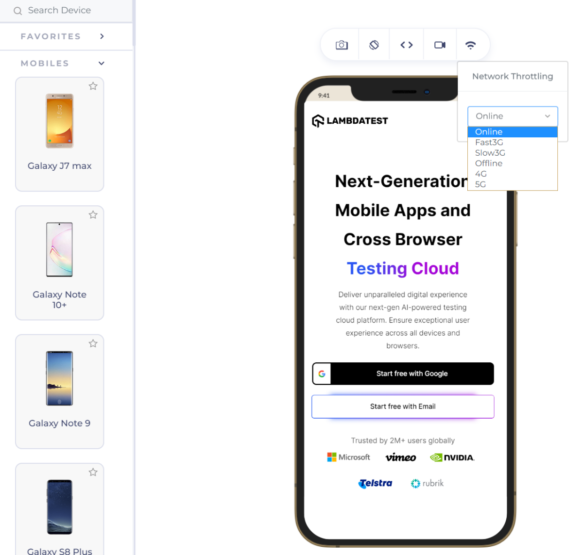
Step 2: Select Device Viewports
While this browser will have many elements, a few important ones are marked in the above image. Their significance is as follows:
- Address bar: To enter the web address that will be opened on the devices.
- Screenshot: To take the screenshot of the current screen.
- Rotate: To rotate the device towards a different orientation (from landscape to portrait or vice-versa).
- Debug: To open the dev tools and debug the code using a web inspector.
- Video recording: To record the video of your entire session.
- Network throttling: To regulate the network on different bandwidths to check the website’s behavior, especially under poor network conditions.
- Device: The device chosen for testing.
Step 3: Start Testing
Upon entering the URL, hit the Enter button and start your responsive testing.
The above two methods: responsive testing using LambaTest and LT Browser, when combined and used wisely according to the situation, will eliminate the need for any other tool for responsive testing of the web application.
Conclusion
Two people can experience poles apart for the same web application. This is because they both opened the application on different devices, and the team of testers did not take responsive testing seriously. As a result, the company loses trust, its audience, and the revenue that could have been generated. Nobody wants to deliver such an experience to the users and make them think twice before opening the link to your website.
Responsive testing is a savior to the deep fragmented mobile device world we currently live in. It helps keep a check on the web elements, especially those that are infamous for behaving abruptly, such as images and grids. Considering the number of devices on which testing is required, it is always recommended to use a tool that provides real devices or emulators and is available on the cloud to avoid local resource consumption. This post explored the depths of responsive testing with LambdaTest at its center. Both of these elements guarantee a high-quality application that does not care about the device on which it is operated. Hard to believe? Sign up for free and experience yourself!
About the Author

Harish Rajora is a computer science engineer. He loves to keep growing as the technological world grows. He feels there is no more powerful tool than a computer to change the world in any way. Apart from his field of study, he likes reading books a lot and writing sometimes.


