

How to Design a Landing Page in Figma
Creating a landing page in Figma might seem difficult for beginners, but if you learn how to do it, doing it becomes quite simple and enjoyable! The new version of Figma concentrates on making it easy to use, collaborate, and create beautiful layouts. This implies that you can create an entire landing page without the need for complicated software.

In this tutorial, starting from an empty file, a complete landing page design will be developed. The design is segmented into concepting, breaking it down into sections, spacing, grid implementation, image addition, and preparation of the design for handover. Each and every step is very much feasible and exhibited based on what can be done in Figma.
You don’t need any design experience to follow this. The idea is just to walk slowly through each step and see how your design changes as you progress.
Before You Start — Understand What a Landing Page Is
The landing page represents a simple web page that holds only one primary goal to achieve. It may include such goals as:
- to get sign-ups
- to advertise a product
- to collect leads
- or to encourage users to click a button
Although a full site consists of multiple pages, a landing page is normally short and straightforward. Hence, the design layout is also simple.
A typical landing page always consists of:
- a header with navigation
- an main message section (hero)
- some benefits or features
- a strong call-to-action
- a small footer
When you realize this pattern, design is much simpler.
Designing with Intention Before Starting the Layout
Before jumping into the design work, it helps to look at a landing page as a guided journey rather than just a bunch of placed sections on a screen. Every visitor landing on your page is trying to make sense of something: what the product is, why it may matter, and whether it is useful to them. By designing in Figma, you frame this journey through layout, spacing, and structure. That is why it is very important to consider clarity, reading flow, and simplicity in advance.
Ask yourself a few basic questions: what is the main message users should understand first? Which action you want them to take by the end of the page? Which parts are essential, and which ones are optional? The moment these questions are clear, you are going to design with intention instead of guessing as you go. In this way, you also avoid clutter or unnecessary visuals. A landing page works best when every element has a clear purpose, be it a headline, a button, or an image placed beside the text.
Step 1 — Open Figma and Create a New File
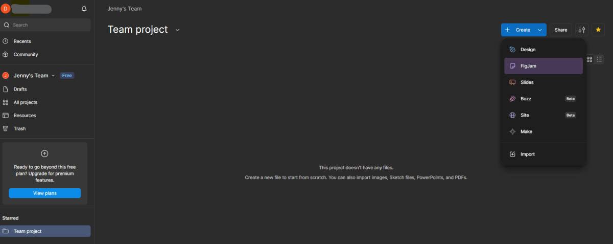
Open Figma and log into your account. From the dashboard, click New design file. This opens a blank canvas.
You can think of the canvas as a big white sheet where you are going to build your page layout. Nothing is designed yet at this stage, which is just fine. For now, just create space where your design will live.
If you’re new to Figma, don’t worry so much about the tools or features quite yet. Just get comfortable with the workspace.
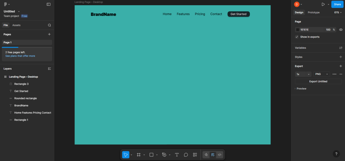
Step 2 — Create a Desktop Frame for the Page Layout
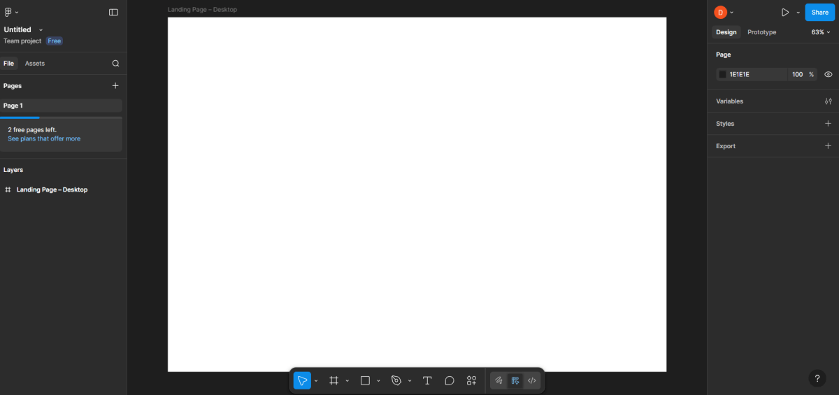
Most of the time, landing pages are created with desktop as the primary device. To set the workspace:
- Use the Frame tool (F).
- From the panel on the right, select Desktop (1440 px).
- A frame shows up, which indicates the width of your webpage.
Change its name to something like Landing Page – Desktop that is easy to understand. This is useful when there will be several frames later on.
Step 3 — Add a 12-Column Layout Grid
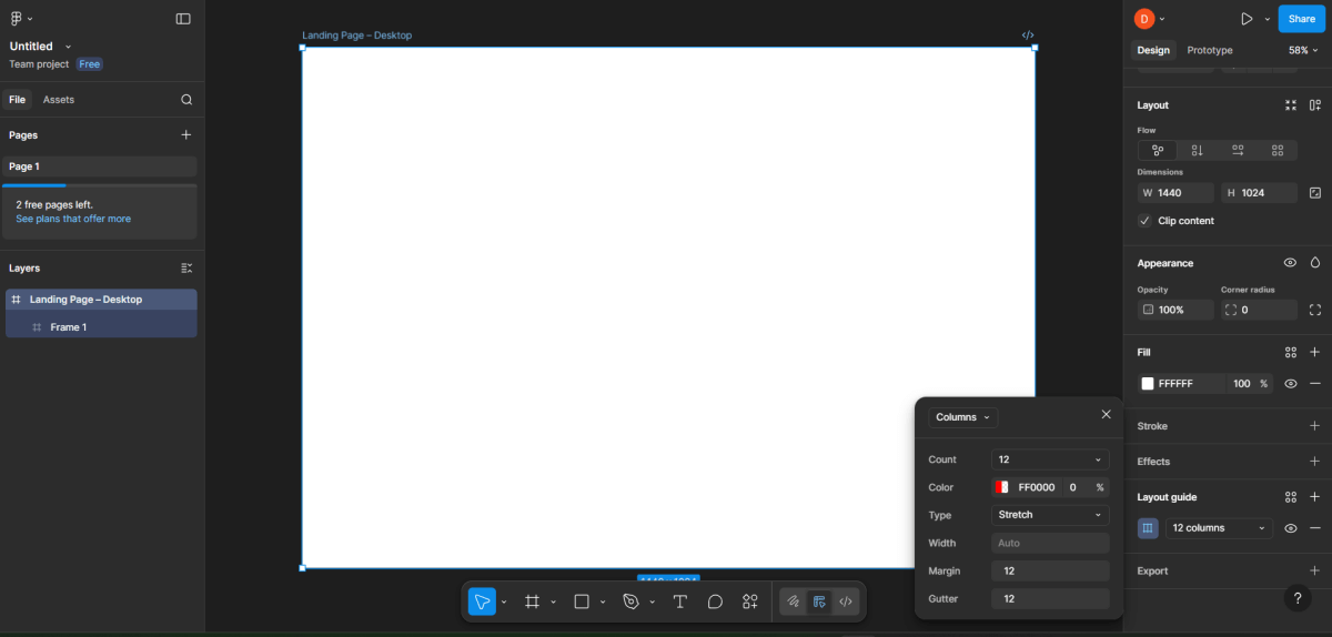
An orderly arrangement of a grid maintains the same distance between objects. It is a great aid in the proper positioning of elements and it also eliminates the possibility of having disorganized layouts.
- The frame has to be marked out first.
- On the right side, select the Layout Grid option.
- Column is the type of grid that you will use.
- Set up the grid to have 12 equal columns with the same margins and gutter.
The majority of the landing pages use a 12-column grid since it is the best option for responsive designs.
Step 4 — Plan the Landing Page Sections
Good landing pages follow a logical flow. Before placing anything, decide the main sections. A simple structure is:
- Header (logo + navigation + action button)
- Hero section (headline + text + main image)
- Features or benefits
- Testimonials or social proof
- Call-to-action section
- Footer
Planning first prevents confusion later and gives the page a clear story.
Step 5 — Design the Header Section
The header is the very first section taking up the top part of your webpage. Keeping it simple and uncluttered should be your main goal.
Now, step by step do the following one after another:
- Pick the Rectangle tool
- Create a slim rectangle at the very top of the frame
- The header background will be this rectangle
Next, the logo is to be added:
- Use the Text tool to select
- Then click on the left part of the header
- Now enter the name of your logo (for example, “BrandName”)
- Font size must be increased so that it resembles a logo
Menu links are to be added next:
- The Text tool is to be used once more
- Create basic links such as “Home”, “Features”, “Pricing”, “Contact”
- Position them on the same line with spaces in between
- Slightly center or right-align them
Right after, the button is to be added:
- On the right side, draw a small rectangle
- Only slightly round its corners
- Put a text on top like “Get Started”
- Align the text inside the button to be in the middle
- Use your main color as the button’s fill color
The header should, however, be neat and not congested.
Step 6 — Create the Hero Section
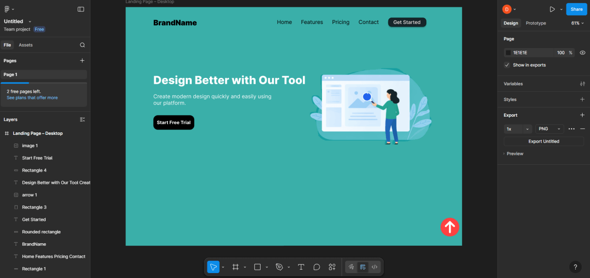
The hero section is the most prominent area right after the header. Users can easily lose track of what site they are on here.
Make sure to perform the following actions precisely:
- Make a certain amount of space underneath the header
- Choose the Text tool
- Click the left area of the page
- Input your primary heading (large title), for example: “Design Better with Our Tool”
Make the heading as follows:
- Raise the font size
- Make it bold
- Use few words and convey a deep meaning
Next, insert supporting text:
- Below the heading, open up another text box
- Explain in simple terms, example: “Using our platform, design modern things fast and easy.”
Now, place a primary button:
- Draw a rectangle under the text
- Write “Start Free Trial” as the text
- Use your brand’s main color for the button
- The button should have uniform margins around it
Now, place the main image:
- On the hero area’s right side
- Draw a rectangle or a placeholder frame
- Insert an image or leave it as a placeholder
Make certain that the text and the image don’t overlap.
Step 7 — Build the Features Section Using Simple Cards
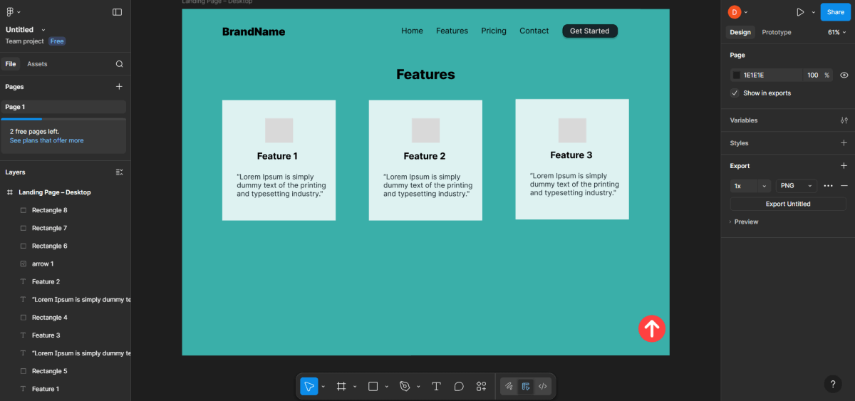
Scroll down and start the next section — Features.
Now do this in a straightforward succession
- Draw a big heading that says “Features”
- Below it, create several rectangles feature cards
- Inside each card add:
- A small icon, or placeholder
- A short title
- A two-line synopsis
Equally space the cards.
Do not stuff too much text in them.
Step 8 — Add Icons to Each Feature
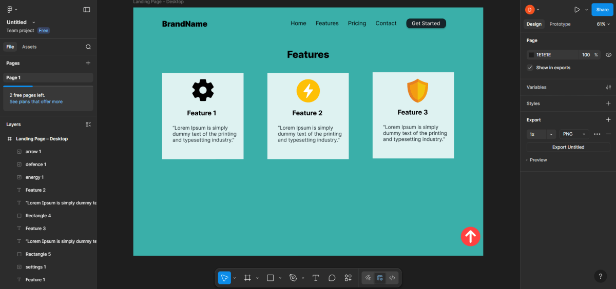
Icons help users visualize features.
Steps to follow:
- Import icons or use simple placeholders
- Place the icon at the top of each card
- Make sure that
- All icons share the same size.
- Same style
- Same alignment
Mix and match styles of icons.
Step 9 — Create the Testimonials Section
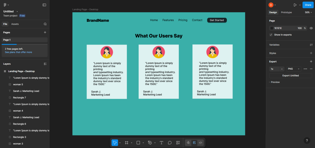
The section establishes trust.
Follow this order:
- Add the heading: The title should be “What Our Users Say”.
- To make 2-3 testimonial
- In each box add:
- A circular photo or placeholder
- Brief quote
- User Name and User Role
Use a subtle background or light shadows so the cards are subtly highlighted.
Step 10 — Create the Call-to-Action Section
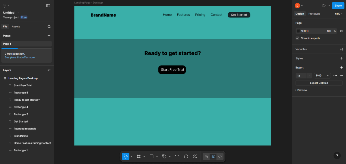
You are asking the users to take action. Users then take the action.
Take a closer look at it carefully:
- Draw a wide rectangle as a section background
- Add a short text, such as “Ready to get started?”
- Place one big button below the text.
- Use your primary color for the button
- Keep only one clear action here.
Step 11 — Design the Footer
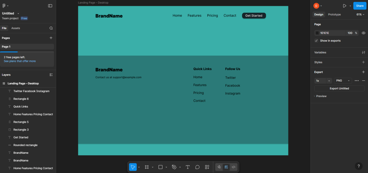
Footer is the last section.
Steps:
- Create a rectangular footer area
- Add:
- Logo or name
- Useful links in columns
- Email or support text
Use a small text size inside the footer.
Step 12 — Use Auto Layout for Cleaner Spacing
Select groups, such as cards, buttons, and lists, and convert them into Auto Layout.
This helps you:
- Keep consistent spacing.
- Auto padding adjustment
- Re-order content with ease
Auto Layout automatically makes the design scalable when you add more items later.
Step 13 — Apply Constraints for Responsive Layout Behavior
When the frame size changes constraints tell how items act. Constraints keep the layout consistent. I notice that items follow the rules set by constraints.
Examples:
- Logo pinned to the left
- Navigation pinned to the right
- The buttons are centered or placed at a fixed position.
This step prepares your design for the development handover phase.
Step 14 — Preview the Landing Page in Presentation Mode
Click Present to open preview mode.
This allows you to:
- View the design as a real-looking webpage
- Test scrolling
- Share a preview link with others
Use this mode to identify spacing or readability issues.
Step 15 — Final Quality Review
Conduct a final read-through and ask yourself:
- Are the nuances conveyed?
- Is the primary call to action easily discoverable?
- Are the sections visually connected but not cluttered?
- Is everything in line with the grid?
- Are colors and typography consistent?
If the answer is yes, then the landing page design process is complete.
Here is how the ready landing page could look like:
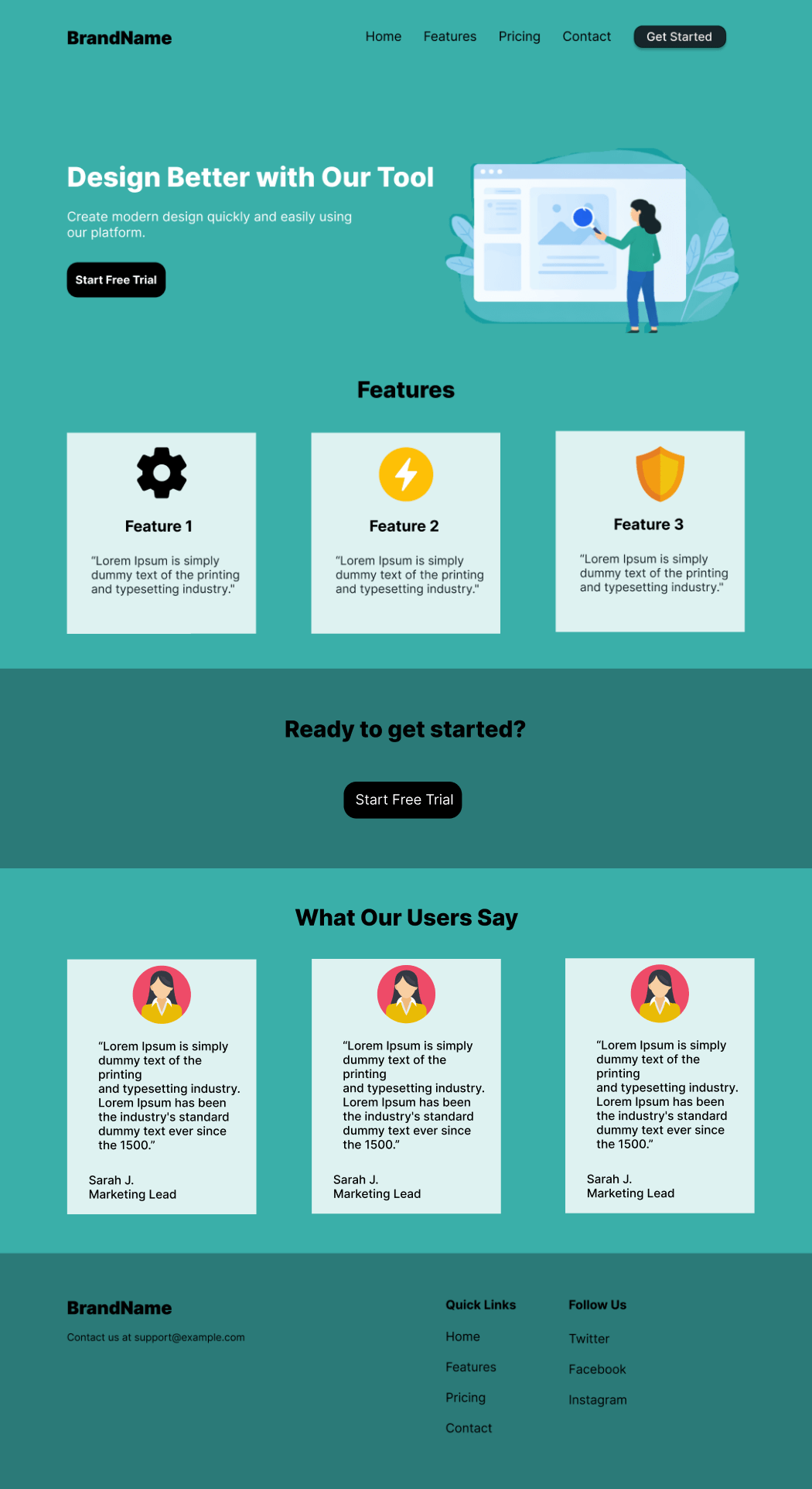
Evaluating the Page as a Complete User Journey
After the process of designing the page and developing every aspect of the landing page, it is a good practice to take a step back and evaluate the process from top to bottom. Instead of examining the page from a granular point of view or a component-by-component standpoint, it is useful to experience the page from top to bottom from a flowing perspective.
Read the texts slowly, scroll down the page, and see whether the page seems natural and easily consumable. See whether the hero message correlates with the features Following the testimonials echo the promises made earlier on the page.
This is a good point in the process of evaluation where you can spot the distractions – things that catch your eye but aren’t adding any worth to the process. You will be able to spot a point where you remove or simplify some concepts of the page and it becomes better.
Conclusion
A landing page design process for Figma can go smoothly with an organized step by step process.
First, you create your frame and grid system, then systematically add each element to your landing page: header, hero, features, testimonials, call to action, then footer. While you do these steps, you also make choices regarding typographic treatment, color, placement, and alignment to make sure your landing page is clean and professional-looking. Essentially, you are not only adding elements to your landing page but also directing attention to where you want the viewer to see.
When you’re done with your layout, you then review, refine, and export or pass along to developers. When you learn to do these steps, you can create designs not only for landing pages but also create an action plan to repeat for future projects.
About the Author

Anna Malik – digital nomad, enthusiast of everything online and in the cloud, productivity maniac. She travels around the world reviewing web applications and other resources for Web People for our blog.


